

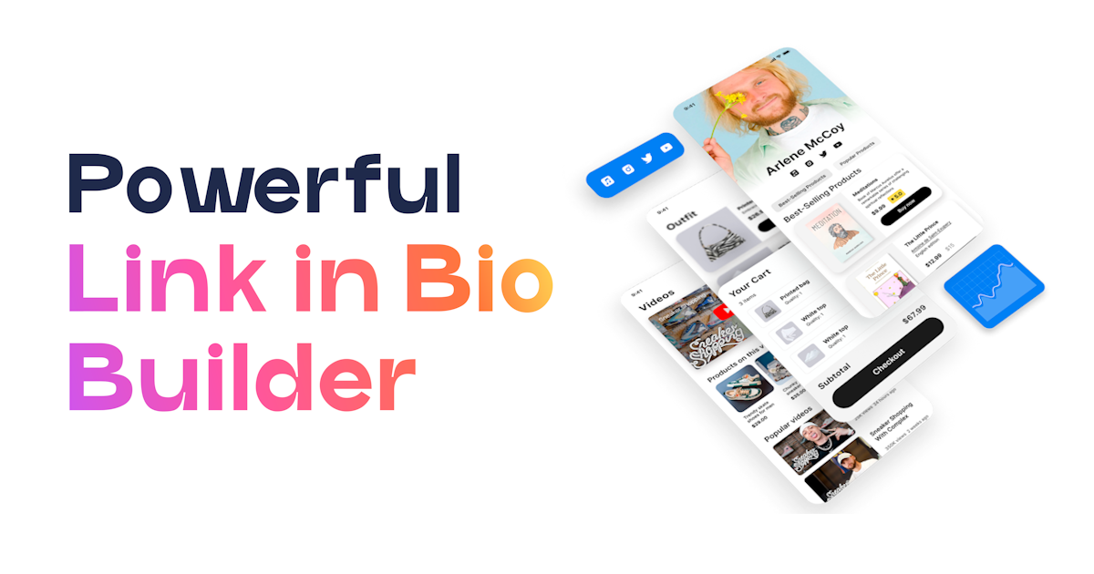
How to Use the Features Block in UniLink (Highlight Key Benefits on Your Page)
How to Use the Features Block in UniLink (Highlight Key Benefits on Your Page)
A step-by-step guide to adding the Features block to your UniLink page so visitors can scan what you offer in seconds — without reading paragraphs of text or scrolling through a wall of descriptions.
- The Features block displays icon-plus-headline-plus-description cards in a grid — ideal for showing what is included in a course, what services you offer, or what makes your product different, all in a scannable format.
- Keep each description to one or two sentences; the block is built for scanning, not reading — if a feature requires a paragraph to explain, it belongs on a separate page, not in this grid.
- Limit yourself to five or six feature cards; more than eight creates cognitive overload and the weakest features dilute the impact of the strongest ones.
- Choose icons that match the meaning of the feature, not just icons that look good — a mismatched icon forces visitors to read the text to understand the card, which defeats the purpose of having an icon at all.
Most people decide whether to read a page or leave it within the first few seconds of arrival. In those seconds, a wall of paragraph text does not get read — it gets glanced at and judged by visual density alone. The Features block is designed for those first seconds. It gives visitors a scannable grid of exactly what you offer, what is included, or what makes your product worth their attention — organized as icon-plus-headline cards that can be processed in parallel, not sequentially. A course creator showing "eight live sessions," "lifetime access," "private community," and "certificate of completion" in a four-card grid communicates the package value in under ten seconds of scanning. A service provider showing "strategy call," "weekly check-ins," "Slack access," and "90-day roadmap" does the same. The Features block does not replace your detailed offering description — it creates the visual anchor that makes a visitor want to read the rest of your page.
What the Features block does
The Features block renders a grid of feature cards, each containing three elements: an icon, a headline, and a description. The icon is drawn from a library of 200-plus icons built into the editor, or you can upload your own custom icon file. The headline is a short label for the feature — typically three to five words — and the description is one or two sentences that provide the key context. The grid layout is configurable: you choose two or three columns, which determines how many cards sit side-by-side in each row. On mobile, the block automatically stacks cards into a single column regardless of the desktop column setting, so a three-column grid on desktop becomes a single-column list on a narrow phone screen.
Card styling is also configurable at the block level. You choose between outlined cards (a visible border around each card), filled cards (a solid background color behind each card), and ghost cards (no visible container — the icon, headline, and description float on the page background). Outlined and filled styles are useful when you want each card to feel like a distinct unit and you want the grid to have strong visual structure. Ghost style works better on pages with dark or textured backgrounds where visible card outlines would compete with the background itself. Alignment within each card can be set to left (the most readable alignment for text-heavy cards) or center (the most common for marketing-style feature grids with short headlines and minimal descriptions).
The icon color setting applies to all icons in the block simultaneously, which means a single color choice creates visual consistency across the entire grid. This is intentional — a grid where every icon is a different color looks like a patchwork of unrelated items rather than a cohesive set of features. If you want specific icons to stand out from others, use the card style (filled vs. ghost) to create contrast rather than varying icon colors.
Before you start
- Write out every feature you are considering — then cut: Before opening the Dashboard, list every feature, benefit, or included item you might want to show. Then identify the five or six that are most compelling to your specific audience. The ones that got cut are still true, but they are secondary — put them in a detailed text block below the Features grid if they need to appear on the page, not in the features grid itself.
- Write headlines as nouns, not sentences: Feature headlines work best as descriptive nouns or short noun phrases — "Live Q&A sessions," "Private Slack channel," "Lifetime access," "90-day roadmap." Avoid starting them with verbs ("Get access to...") or full sentences. The visual pattern of the grid trains visitors to read each card as an item, not a sentence, and headlines that break that pattern slow reading down.
- Write descriptions that answer "what does this mean for me?": Each description should explain the feature in terms of its benefit to the visitor, not just its technical existence. "Weekly group coaching calls" is a headline. "Bring your real challenges to a live group call every Tuesday and get direct feedback from the instructor" is the description that makes the headline meaningful. One to two sentences is the limit — if you need more, the feature deserves its own section.
- Match icons to meaning before opening the block editor: Think about the icon for each feature before you start building. Search the icon library in your mind: what icon genuinely communicates this feature at a glance? A graduation cap for certifications, a calendar for sessions, a lock for access, a chat bubble for community support. If you cannot think of an obvious icon match, the built-in library gives you 200-plus options to browse — but having a rough idea saves time in the editor.
How to add the Features block to your page
- Open your page in the Dashboard: Log in to UniLink, go to My Pages, and click Edit on the page where you want the feature grid to appear.
- Add a new block: Click + Add Block. In the block picker, find Features — it is typically listed under Marketing or Content — and select it.
- Set the number of columns: In the block settings panel, choose between two and three columns. Use two columns if your descriptions are longer (two-sentence descriptions with meaningful detail); use three columns if your cards are headline-forward with minimal description text. More columns means smaller cards — descriptions that work at two columns may be cramped at three.
- Choose a card style: Select Outlined, Filled, or Ghost depending on your page's visual design. If in doubt, Outlined is the safest default — it creates clear card boundaries without requiring a background color decision.
- Set the icon color: Choose a color for all icons in the block. This should either match your brand accent color or coordinate with the overall palette of your page. Remember this applies to all icons in the block at once.
- Set the text alignment: Choose Left or Center. Left alignment reads more naturally for descriptions longer than one line; Center alignment looks cleaner for short headline-plus-one-sentence cards where visual balance matters more than text flow.
- Add your first feature card: Click Add Feature. Open the icon library and search for or browse to the icon that best matches the feature. Enter the headline (three to five words) and the description (one to two sentences).
- Add remaining feature cards: Repeat for each additional feature. Keep checking the preview as you build — the grid preview shows you how the cards balance against each other in real time, and it is easier to catch an overly long description now than after publishing.
- Save and publish: Click Save and then Publish Page. Check the live page on mobile to confirm the grid collapses to a single-column stack cleanly and that no card's text is cut off or truncated on smaller screens.
Key settings explained
| Setting | What it controls | Best practice |
|---|---|---|
| Number of columns | How many cards appear side by side in each row on desktop | Two columns for cards with substantive descriptions; three columns for headline-light cards with minimal text; never use three columns if any description runs longer than two lines — the cards become too cramped to read comfortably |
| Card style | Outlined (visible border), Filled (solid background), or Ghost (no container) | Outlined is the most universally clean default; Filled is effective on pages with a white or very light background where you need visual weight; Ghost works best on pages with rich background colors or textures where outlines would compete |
| Icon library selection | The icon displayed at the top of each feature card, chosen from 200+ built-in icons or a custom upload | Choose icons based on semantic match — the icon should make the card's subject recognizable before the visitor reads the headline; generic icons (a star, a checkmark) that could apply to any card provide less value than specific icons that telegraph the feature's nature |
| Icon color | The color applied to all icons in the block simultaneously | Use your brand accent color or a consistent color that coordinates with the rest of the page; varying icon colors within a block creates a visual incoherence that makes the grid look like a collection of unrelated items |
| Alignment | Left or center alignment for the icon, headline, and description within each card | Left for descriptions that run two or more lines (left alignment is more legible for multi-line text); Center for cards with short descriptions where visual symmetry matters more than text flow |
| Number of feature cards | Total number of cards in the grid | Five to six is the optimal range — enough to communicate breadth without cognitive overload; cut ruthlessly to keep only the features that are genuinely compelling to your target visitor |
How to write feature cards that actually move visitors toward a decision
The difference between a Features block that converts and one that just fills space is in the relationship between the headline and the description. A weak feature card states a feature — "Community access." A strong feature card states a feature and immediately answers the "so what?" — "Private community" as the headline, "Connect with 300+ peers in the same niche, ask questions, share wins, and stay accountable with weekly group check-ins" as the description. The visitor reads the headline, gets the category, reads the description, gets the value. That sequence — category, then value — is what moves a visitor from "understood" to "interested."
The five-to-six card maximum is not an arbitrary constraint — it reflects how human attention works in a scanning mode. When a visitor looks at a feature grid, they do not read every card in order; they scan for the card that answers their specific concern. If there are twelve cards, that scan takes longer, more cards are ignored, and the weakest cards dilute the impression left by the strongest ones. Six cards means the visitor can process the full grid in two to three seconds, find the one or two features most relevant to them, and feel like the offering is focused and well-curated. Twelve cards feels like a features dump — the page equivalent of a product box covered in small print. Cut to the six features that a visitor at the exact moment of decision would find most compelling, and put the rest in a detailed FAQ or description section below.
Icon matching deserves specific attention because it is where the most common mistake happens: choosing icons that look good together rather than icons that mean something individually. A grid of six cards where every icon is a slight variation on a circle, shield, or checkmark teaches visitors nothing from the icons alone — they have to read every headline to understand each card. A grid where each icon genuinely previews the feature's category — a calendar for scheduling, a chat bubble for community, a certificate for credentials, a video camera for recorded content — allows visitors to scan the icons first, identify which cards are relevant to their concerns, and then read only those headlines and descriptions. Icons that communicate before the text is read are doing their job; icons chosen purely for visual aesthetics are decorative, not functional.
Troubleshooting common issues
| Problem | Likely cause | Fix |
|---|---|---|
| Grid looks unbalanced — some cards are much taller than others | Descriptions vary significantly in length across cards | Edit descriptions to be more consistent in length — aim for one to two sentences per card; the grid looks most balanced when cards are similar heights, which requires descriptions of roughly similar word counts |
| Icons look blurry or pixelated (custom uploads) | Custom icon file uploaded at too low a resolution or in a lossy JPEG format | Replace with an SVG file (recommended) or a PNG at 2x the intended display size — for an icon displayed at 48px, upload at 96px minimum; avoid JPEG for icons, which introduces compression artifacts at small sizes |
| Three-column layout is unreadable on mobile | Expected behavior — mobile always collapses to single column, but descriptions that were acceptable at three columns per row may be too long when viewed in full page width | This is working as intended; check the mobile preview after building and shorten descriptions that expand uncomfortably to multiple lines when the card occupies the full mobile width |
| Feature block saved but not appearing on the live page | Page was saved but not published after the edit | Return to the Dashboard editor and click Publish Page — saving stores the draft state, publishing makes it visible to visitors on the live URL |
| All icons look the same color despite setting a new icon color | Icon color setting applies to all icons in the block simultaneously — this is the intended behavior | If you need different icon colors for different cards, split the content into two separate Features blocks with different icon color settings, stacked vertically on the page |
Best fit for
- Course creators and educators who want to show exactly what is included in their program in a format that can be scanned in seconds rather than read over minutes
- Coaches and service providers who need to communicate their methodology or what clients receive as part of a package, without a lengthy text explanation
- Software creators and SaaS operators who want to list product features in a format that visitors can compare and evaluate at a glance
- Freelancers and agencies who offer clearly defined services and want those services visible without requiring visitors to read through a full page of descriptive text
Not the right tool if
- Your offering is a single thing that requires narrative explanation rather than a list of distinct components — a Features block implies a package or set, not a single product or experience
- You want visitors to compare two offerings side by side — use a compare table block for that, which is specifically designed for comparison rather than individual feature highlighting
- Every feature you have requires more than two sentences to explain — features that need detailed explanation belong in an FAQ or separate section, not in cards that are sized for scanning
Frequently asked questions
How many feature cards is too many?
Eight is the practical upper limit, and five to six is the sweet spot. Beyond eight cards, the grid becomes a features dump — visitors stop processing individual cards and start feeling overwhelmed. The goal is not to list everything; it is to show the most compelling subset of what you offer so that visitors who are a good fit feel immediately understood and visitors who are not a good fit self-select out quickly. If you genuinely have more than eight features worth showing, split them across two Features blocks with distinct section headings — "What you get" and "How we work together," for example — rather than putting all of them into a single grid.
Can I use custom icons instead of the built-in icon library?
Yes. Each feature card has an option to upload a custom icon file instead of selecting from the library. SVG files are the best format for custom icons because they scale perfectly at any size. PNG files work if they are uploaded at 2x the intended display size. Custom icons are useful when you have brand-specific icons from your existing design system or when the built-in library does not have an icon that matches a specialized concept in your field.
Should features be ordered by importance or by category?
Order by importance to your specific audience, not by logical category grouping. Visitors scan from left to right and top to bottom, so the first card in the top-left position gets the most attention. Put your single most compelling feature — the one most likely to create an "I need this" reaction in your target visitor — in the first position. The second most compelling feature goes in the second position. If you have a set of features that only matter to a subset of your audience, put those at the end of the grid rather than in the center where they are given equal visual weight to more universally compelling features.
Is the Features block different from using a bulleted list in a text block?
Yes, in two significant ways. First, visual weight: a Features block with icons and cards is more scannable than a bulleted list because the icons provide parallel visual entry points into each item — visitors can look at icons first and read selectively, rather than having to read a list sequentially. Second, layout: a Features block displays items in a grid (side by side), which fits more information into less vertical space on the page than a top-to-bottom bulleted list. For features you are actively trying to sell against, the Features block does more visual work. For supplementary information or specifications, a bulleted list in a text block is simpler and perfectly adequate.
- The Features block displays icon-plus-headline-plus-description cards in a two- or three-column grid — it is designed for scanning, not reading, which means it works best when every card is digestible in under five seconds.
- Limit cards to five or six, write headlines as short noun phrases, and keep descriptions to one or two sentences — the block's effectiveness is directly proportional to how easily a visitor can process the whole grid in a single scan.
- Choose icons that communicate meaning before the headline is read; icons that do not add signal independently are decorative, not functional.
- Position the Features block after your hero section and before pricing or testimonials — visitors need to understand what they are getting before they can evaluate whether it is worth having.
Ready to show visitors exactly what makes your offer worth their attention? Create your free UniLink page and add a Features block — scannable, visual, and built to communicate the value of what you do in the first seconds of every visit.
Create Your Free Link-in-Bio Page
Join thousands of creators using UniLink. 40+ blocks, analytics, e-commerce, and AI tools — all free.
Get Started Free