

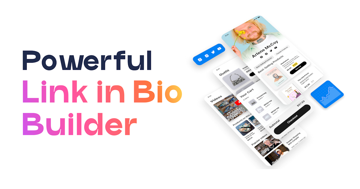
How to Use the Menu Block in UniLink (Add Navigation to Your Bio Page)
How to Use the Menu Block in UniLink (Add Navigation to Your Bio Page)
A step-by-step guide to adding the Menu block to your UniLink page so visitors can jump between sections instantly — using anchor links, a sticky top bar, or a mobile hamburger menu — without losing their place or having to scroll through the entire page.
- The Menu block adds a navigation bar to your UniLink page with links that can jump visitors to a specific section on the same page (anchor links) or navigate to an external URL — making it essential for long single-page setups with multiple sections.
- Anchor links only work when the target block has a matching section ID set in its own block settings — a menu item pointing to
#shopwill do nothing if the Shop block does not have "shop" entered as its section ID. - Sticky menu is the right choice for most pages longer than three sections — it keeps navigation permanently accessible while visitors scroll instead of requiring them to scroll back to the top to change sections.
- Keep mobile menus to five or six items maximum — more than six menu items on a mobile hamburger creates a cramped, difficult-to-use navigation that defeats the purpose of having a menu at all.
A long bio page without navigation is a guessing game for the visitor. They arrive, see a block near the top, and have to scroll to find whatever else you have — Shop, FAQ, Contact, About. If they scroll past it, they have to scroll back. If they are on mobile, that scrolling is even more effortful. The Menu block solves this directly: it puts a navigation bar at the top of your page with labeled links that jump the visitor to exactly the section they want, instantly. For pages with four or more distinct sections, a sticky menu is not a luxury — it is the difference between a page visitors can actually navigate and one they skim and leave because finding what they want requires too much effort.
What the Menu block does
The Menu block adds a navigation bar to your UniLink page. Each item in the menu is a label paired with either an anchor link (a jump to a specific section on the same page, using a #section-id format) or a regular URL (a link to another page or external site). Visitors click a menu item and either jump to that section instantly or navigate to the linked destination. The menu can be set to sticky, meaning it scrolls with the visitor and stays at the top of the viewport at all times, or static, meaning it stays at its position in the page layout and disappears from view when scrolled past.
On desktop, the menu renders as a horizontal top bar by default — the most familiar navigation pattern for web pages. On mobile, the menu can display as a compact horizontal bar (for short menus of three to four items) or collapse into a hamburger icon that expands into a dropdown list when tapped. The hamburger layout is the right choice for menus with five or more items, where a horizontal bar on a narrow mobile screen would either overlap or become too small to tap comfortably. The breakpoint at which the layout switches from horizontal to hamburger is configurable.
Each menu item can optionally include a small icon alongside the label — useful for visual differentiation when menu items represent distinct types of content (a shopping bag icon for Shop, an envelope icon for Contact, a star icon for Reviews). Icons are not required and work best when they reinforce obvious associations rather than replace text labels. A menu item with only an icon and no label creates accessibility problems and should be avoided unless the icon meaning is completely unambiguous — which is rarely the case across a diverse audience.
Before you start
- List your sections and decide which need menu items: Go through your page block by block and identify the distinct sections a visitor might want to jump to. Common menu items include Shop, About, FAQ, Contact, Links, Reviews, and Blog. You do not need a menu item for every block — only for sections that are meaningful navigation destinations. If two consecutive blocks together form a "Contact" section, one menu item pointing to the first of those blocks is sufficient.
- Assign section IDs to target blocks: For every section that will be a menu anchor destination, open that block's settings in the Dashboard and set a section ID — a short, lowercase, hyphenated identifier like
shop,about,contact, orfaq. This step is required before anchor links will work. Write down the ID you assign to each block because you will need the exact string when you configure the menu items. A mismatch between the menu's anchor target and the block's section ID is the most common reason anchor links silently fail. - Decide on sticky vs. static: If your page has three or more sections and any of them require scrolling to reach, use a sticky menu. If your page is short enough that all content is visible within one or two screen heights, a static menu is fine and has less visual weight. For most pages that benefit from a menu at all, sticky is the correct choice — the menu's value is in being accessible at all times, not just at the top of the page.
- Plan your item count for mobile: Count your intended menu items. If you have more than six, reconsider — reduce to the five or six most important sections and link to secondary sections from within the page content instead. Six is a practical ceiling for mobile usability; beyond six, the hamburger dropdown becomes a list that visitors have to scroll, which eliminates most of the navigation benefit.
How to add the Menu block to your page
- Open your page in the Dashboard: Log in to UniLink, go to My Pages, and click Edit on the page where you want to add navigation.
- Set section IDs on target blocks first: Before adding the Menu block, go to each block that will be a navigation destination and open its settings. Find the Section ID or Anchor ID field and enter your chosen identifier (e.g.,
shop,faq,contact). Save each block. Do this for all anchor destinations before you create the menu — it prevents the back-and-forth of adding menu items and then discovering the anchors do not work because the section IDs were not set. - Add the Menu block: Click + Add Block. In the block picker, find the Navigation or Layout section and select Menu. Place the block at the top of your page block list so it renders above all content.
- Add menu items: In the Menu block settings, click Add item for each navigation link. For each item, enter a label (the text visitors will see) and a link. For anchor links to sections on the same page, use the format
#section-id— for example,#shopto jump to the block with section ID "shop." For links to external pages or other UniLink pages, enter the full URL. - Enable sticky if needed: Toggle on Sticky menu if you want the navigation bar to remain fixed at the top of the viewport while visitors scroll. This is recommended for pages with four or more sections.
- Configure mobile layout: Choose whether the mobile layout should be a compact horizontal bar or a hamburger menu. If you have four or more items, select hamburger. Set the breakpoint (the screen width below which the hamburger appears) if the default does not match your design.
- Set active link highlight: Enable the active link highlight if you want the menu item corresponding to the currently visible section to appear visually distinct (bolder, a different color, underlined). This provides visitors with a sense of location within the page and is especially helpful on long pages with many sections.
- Set background color, font size, and text color: Style the menu to match your page design. The menu background color should contrast enough with your page background that the navigation bar is clearly visible, but not so strongly that it competes with your content visually. Keep font size readable at small screen sizes — menu labels need to be legible, not decorative.
- Save and test on a real device: Save the block, open the live page on both desktop and a mobile phone, and click every menu item. Verify that anchor links jump to the correct section, that external links open the correct destination, and that the sticky behavior works as expected. Test the hamburger menu on mobile specifically — tap the icon, verify the dropdown opens cleanly, and tap each item to confirm it navigates correctly.
Key settings explained
| Setting | What it controls | Best practice |
|---|---|---|
| Menu items (label + link) | The navigation links displayed in the menu bar — each item has a label and a destination that is either an anchor link (#section-id) or a full URL |
Use short, clear labels (1–2 words); use conventional names like "Shop," "About," "Contact" rather than creative ones visitors have to interpret; limit total items to five or six for mobile usability |
Anchor links (#section-id) |
Links that jump the visitor to a specific section on the same page — the target block must have a matching section ID set in its own settings for the jump to work | Always set the section ID on the target block before configuring the anchor link in the menu; test every anchor link on the live published page, not in the Dashboard preview, since anchor behavior can differ between environments |
| Sticky toggle | Whether the menu bar stays fixed at the top of the viewport while the visitor scrolls (sticky) or stays at its page position and scrolls out of view (static) | Enable sticky for pages with three or more sections — the menu's main value is being accessible at all times; a static menu that disappears when the visitor is halfway down the page provides minimal navigation benefit |
| Mobile layout (horizontal / hamburger) | Whether the menu displays as a horizontal bar or collapses into a hamburger icon that expands on tap on mobile screens | Use hamburger for four or more menu items on mobile — a horizontal bar with many short labels on a narrow screen becomes too small to tap reliably; the hamburger keeps the navigation clean and usable |
| Mobile breakpoint | The screen width (in pixels) below which the mobile layout (hamburger) activates | The default breakpoint (typically 768px) works for most pages; adjust lower (e.g., 480px) only if you have a very short menu that reads well in horizontal form on tablet-sized screens and only needs hamburger behavior on phone screens |
| Active link highlight | Visual styling applied to the menu item corresponding to the section currently visible in the viewport — color, weight, or underline | Enable for pages with five or more sections where visitors benefit from knowing their current location; keep the active styling subtle (a color shift or underline) rather than dramatic (background color inversion) to avoid it competing with the content below |
| Icon per menu item | An optional icon displayed alongside the label for each menu item | Use only when the icon adds clear meaning — a shopping bag for Shop, an envelope for Contact; never use icons as a replacement for labels on a public page with a diverse audience; icons without labels create accessibility problems for screen reader users |
#FAQ and #faq are different targets. Use all-lowercase, hyphenated IDs throughout (e.g., faq, about-me, online-shop) to avoid capitalization mismatches entirely.
When a menu transforms a page from a list into a destination
The clearest signal that a page needs a Menu block is when you or your visitors have to scroll more than two screen heights to find something. A bio page that has grown organically — you added a Shop, then an About section, then a FAQ, then a booking form — is a common example. Each block made sense individually, but the result is a page visitors have to explore rather than navigate. Adding a sticky menu with five clearly labeled items turns that page into something visitors can orient themselves in immediately. They arrive, see the navigation bar, understand what the page contains, and jump directly to what they came for. The bounce rate on pages that force scrolling to find content is consistently higher than on pages where the structure is immediately visible.
Multi-section pages are the primary use case, but the Menu block is also useful for multi-page UniLink setups — where you have multiple pages for different purposes (one for your shop, one for your blog, one for your coaching services) and want visitors on any one page to be able to navigate to the others. In this configuration, menu items point to full URLs rather than anchor links. The sticky behavior is less critical here since the navigation is between pages rather than sections, but the menu still provides a consistent navigation structure across your UniLink presence.
Course creators and coaches benefit particularly from the Menu block. A course landing page might have sections for curriculum, instructor bio, testimonials, pricing, and FAQ — all of which are high-intent destinations for a prospective student evaluating whether to enroll. A sticky menu that labels each of those sections lets a visitor go directly to Pricing or Testimonials without scrolling through Curriculum first. This respects the visitor's time and reduces the friction between landing on the page and finding the specific information that will convert them. Pages that respect visitor attention convert better than pages that require visitors to work to find what they want.
Troubleshooting
| Problem | Likely cause | Fix |
|---|---|---|
| Anchor link click does nothing or jumps to the wrong place | The target block does not have a section ID set, or the section ID does not match the anchor in the menu link exactly — including a capitalization difference | Open the target block's settings in the Dashboard, find the Section ID or Anchor ID field, and confirm it is filled in with an ID that exactly matches the anchor portion of the menu link (without the # prefix); use all-lowercase IDs to prevent case mismatch issues; test on the live published page after saving |
| Sticky menu covers content at the top of the page when navigating to a section | The sticky menu has a height that overlaps the section header when the anchor jump lands — the section appears behind the menu bar | Add a top padding or a scroll margin to the target blocks to offset the anchor landing position by the height of the sticky menu; in the target block's settings, look for a margin or padding top field and add enough space to clear the menu bar height (typically 50–70px) |
| Menu items are too small to tap on mobile | The menu has too many items displayed in horizontal layout on a narrow screen, making each item's tap target too small | Switch the mobile layout to hamburger in the Menu block settings; reduce the total number of menu items if needed; confirm the font size is set to at least 14px for mobile readability |
| Hamburger menu does not open when tapped on mobile | A z-index conflict with another block on the page (a full-width banner, a floating element, or a sticky block) is intercepting the tap event on the hamburger icon | Check whether any other block on the page is set to sticky or has a high z-index value — temporarily hide those blocks to confirm whether the conflict is resolved; if so, adjust the z-index settings for the conflicting block so the menu layer sits above it |
| External link in the menu takes visitors away from the page entirely | External URL links navigate the visitor away from the UniLink page to another site when clicked | This is expected behavior for external links — use external links in the menu only for destinations you actually want visitors to leave the page for; if the goal is to keep visitors on the page, use anchor links to sections instead; if you need the external link, consider whether it should open in a new tab (check if the Menu block has a "open in new tab" toggle per item) |
| Active link highlight shows the wrong menu item as active while scrolling | Section IDs may have duplicate values across blocks, or the highlight calculation is based on scroll position and the sections are very short, causing rapid switching | Verify that every section ID on the page is unique — duplicate IDs cause unpredictable active state behavior; if sections are very short, the highlight may flicker between items; in this case, disabling the active highlight is cleaner than having it behave inconsistently |
Best fit for
- Long single-page UniLink setups with four or more distinct sections — Shop, About, FAQ, Contact, Testimonials — where visitors need a way to navigate without scrolling through everything
- Course creators, coaches, and consultants whose landing pages contain dense information in multiple structured sections that high-intent visitors need to evaluate quickly before deciding to buy
- Multi-page UniLink setups where consistent navigation across pages gives visitors a clear sense of your overall presence and lets them move between your shop, blog, and services pages without confusion
- Any page where analytics show a high bounce rate or low scroll depth — a menu that makes navigation visible and immediate often recovers both metrics
Skip it if
- Your page has only two or three blocks and fits within one or two screen heights — a menu adds visual complexity without providing meaningful navigation value on a page that short
- Your page is a single-purpose landing page designed for one action (click one link, sign up for one thing) — navigation on a focused landing page gives visitors an escape route and typically reduces conversion rates
- Every item you would put in the menu would be an external link that takes visitors off your page — a menu that sends visitors away from your page on every click is a navigation block working against your retention goals
Frequently asked questions
How do I make anchor links work in the Menu block?
Two things must be true simultaneously: the menu item's link must be set to #your-section-id (with the hash symbol and the exact ID you chose), and the target block must have that same ID entered in its own Section ID or Anchor ID field in the block settings. If either is missing or does not match exactly — including capitalization — the anchor will either do nothing or jump to the wrong place. Set all section IDs on your target blocks first, write them down, then enter the corresponding anchor links in the menu. Test on the live published page rather than in the Dashboard preview.
Should I use sticky menu or static menu?
Use sticky if your page requires any meaningful amount of scrolling to move between sections — which describes most pages that benefit from a menu at all. A static menu that scrolls off the screen after two blocks provides almost no navigation value once the visitor is in the middle of the page. Sticky keeps the navigation available constantly. The main reason to choose static over sticky is aesthetic: on very minimal pages or pages with specific visual designs where a persistent top bar feels intrusive, static is the cleaner option. When in doubt, enable sticky and see if it feels right on the live page.
How many menu items can I have?
There is no hard platform limit, but five to six items is the practical ceiling for mobile usability. Beyond six, even a hamburger dropdown becomes a list visitors have to scroll through, which means navigation is no longer instant. If you have more than six sections you want to surface, prioritize the highest-intent ones for the menu (Shop, Pricing, Contact, FAQ are usually the top priorities) and let visitors discover secondary sections through the natural page scroll. A focused, short menu used confidently converts better than an exhaustive menu that tries to surface everything.
Why does the sticky menu cover my section content when I click an anchor link?
When a sticky menu is active and you click an anchor link, the browser jumps to the target section's position on the page — but the sticky menu is overlapping the top of the viewport by its own height. The result is that the section header or first line of content appears behind the menu bar. The fix is to add scroll margin or top padding to the target blocks equal to the height of your sticky menu (typically 60–80px). In each target block's settings, look for a margin top or scroll margin field and enter the offset value. This shifts where the browser considers "the top" of that section to be when it performs the anchor jump.
Can I use the Menu block to link to other UniLink pages, not just sections on the current page?
Yes. Any menu item can point to a full URL — including other UniLink pages you have created. This is how multi-page UniLink setups create consistent navigation: each page has the same Menu block with the same items, and visitors can move between your shop page, your coaching page, and your blog page as if they were navigating a multi-page website. For cross-page links, enter the full UniLink URL of the destination page as the menu item's link value rather than an anchor. Consider whether these links should open in the same tab (replacing the current page) or a new tab, since same-tab navigation takes visitors away from the current page entirely.
- Anchor links require two matching pieces: the menu item link must use
#section-idformat, and the target block must have that exact same ID entered in its Section ID field — if either is missing or mismatched, the anchor silently fails. - Enable sticky menu for any page with three or more sections — a menu that scrolls off screen after the first two blocks provides almost no navigation value for visitors already in the middle of the page.
- Keep mobile menus to five or six items maximum — beyond six, even a hamburger dropdown becomes a scrollable list, eliminating the instant-navigation benefit that makes a menu worth adding.
- If a sticky menu is covering your section headers after an anchor jump, add top padding or scroll margin to the target blocks equal to the sticky menu's height to offset the landing position.
- Do not use the Menu block on single-purpose landing pages designed for one conversion action — navigation on focused pages gives visitors an escape route and typically reduces the conversion rate the page is optimized for.
Ready to add real navigation to your UniLink page? Open your Dashboard and add the Menu block — set your section IDs, configure your anchor links, enable sticky, and turn a page visitors have to scroll into one they can navigate in seconds.
Create Your Free Link-in-Bio Page
Join thousands of creators using UniLink. 40+ blocks, analytics, e-commerce, and AI tools — all free.
Get Started Free